31 design principles for product managers
A list of useful design techniques to make you a better product manager
The relationship between product managers and designers is crucial to building effective products. Whilst it’s not a PMs job to know the intricacies of product design, understanding its foundational concepts will help you deliver more effective solutions.
This is an overview of the design principles I’ve found particularly useful working as a product manager — spanning interaction design, design processes, user experience (UX), user interface (UI) and user psychology.
Start with strategy
Before diving into specific concepts, it’s first worth noting that all design solutions should be considered through a strategic lens. Two basic, yet foundational questions should be asked:
- What do our users want to achieve from this solution?
- What do we want to get out of this product?
Answering these two questions obviously depends on the context of the project, but like with all good strategy, it helps focus a solution around its most critical elements. You could technically build or design anything, but this quickly leads to cognitive overload and wastes your everyone's time.
Providing your designers with a clear goal, with relevant business context, will start any project in a better place.
Interaction design
The foundation of approaching modern digital product design follows from interaction design.
Its goal to create meaningful and effective experiences that align with user needs, business goals, and technical capabilities.
It’s a holistic approach to how people interact with technology, using principles of psychology, art, design and emotion. It also adheres to one of my favourite maxims: design techniques and technologies change, but typically, people don’t. So we can use this understanding of people and their needs to start the design process.
Below you’ll find the elements of interaction design I’ve found most useful to know when working with designers.
1. Affordances
Design affordances ask the following question: what perceptual cues are available to a user to suggest which actions are possible? This principle applies across both digital and physical products.
There are a few different types of affordance that I won’t outline today (explicit, pattern, negative, metaphorical), but at a high level, you may see the following common examples:
- In the the physical world, a common example would be an elevated keyboard button — the only affordance it offers is to be pressed down. Similar for a coffee mug — it affords you to clasp it.
- In a digital space, a file drag and drop is a classic affordance

2. Signifiers
Signifiers ensure discoverability — the feedback is clearly communicated and actionable to any user of the product. They are related to affordances, but rather than suggest actions, signifiers tend to be far more explicit. This might be in the form of visual cues, icons, labels, text instructions, or even sounds.
A ‘sign up’ button on a website would be an example of a signifier — where the clear and obvious function is written for a user.

3. Information architecture
Good design must structure information so people can understand and use it.
Information architecture (IA) comes down to understanding the hierarchy of information on a page, and where to display it. Effective IA helps people understand the information on a page in a way that aligns with their goals.
IA can be applied to many areas of a user experience including taxonomy, categorisation, navigation, sitemaps.
One of the most common problems is creating a categorisation scheme (often in e-commerce) to meet product objectives. You can apply the following approaches, depending on the context of the problem:
- Top-down approach — create IA from an understanding of product and user needs. You’d implement a category and subcategory structure from this. Get categories and sub-categories based on this.
- Bottom-up approach — this is based on analysis of your existing content and any functional requirements vs. a product or user-led approach.
Neither approach is better, provided each step makes sense to your users.
Amazon may be the most common example of IA categorisation people know, showing a clear relationship between categories and subcategories for each set of products.
4. Responsiveness
Since the smartphone revolution in the late 00s, responsiveness has become critical to effective design.
Digital interfaces should adapt to different screen sizes and devices — typically focused on mobile, desktop and tablets. Given most of us in the industry work from our desktops , it’s easy to overlook the importance of designing for mobile. But given over 60% of people browsing the web are using a mobile device, it’s vital any design accounts for this experience.
Pro tip: to assess the responsiveness of a website, you can use Google’s developer tools. You can access this by clicking the three dots in the top right of your browser, click ‘more tools’, then click ‘developer tools’.
From here, you can click the screens icon and adjust the width of the page to see how it responds. You can also add the specific dimensions of devices types to see how a page displays on each.

5. Conceptual models
Conceptual models are mental frameworks that help people understand how a system or product works. It’s basically an abstraction of the thing you intend to build.
These models are closely tied to information architecture as they help people establish connections between various elements.
A practical (and commonly used) example of a conceptual model is a UX flow chart. Before starting early design work, you may sit down with a designer and run through the possible actions users can take within the product experience. Once these actions have been established, it’s easier to carry on with the design.
Another example is a map. Yes, a map. But a map is basically a view of the relationships between elements in a particular geography — a representation of what’s actually on the ground.
6. Conventions
Design conventions are established patterns or practices of how people use products in a specific context. Everyone has pre-conceived notions of how the world works. The same applies to their interactions with digital (and physical) products.
Radically altering a design convention because you think it’s a ‘cool idea’ is likely to cause major usability issues — imagine suddenly deciding that a green light should actually be a signal for stopping instead of red?!
This doesn’t mean you should hamper innovation, but it does mean you should choose your battles wisely — if people are used to something working in a particular way, you need to think carefully before radically changing a pattern.
A few common examples of design conventions include:
- Placing the navigation in the top left of a screen
- Three line ‘burger icon’ — this typically indicates a dropdown table on mobile screens
- The colour red — typically indicates a warning or to signal a user can’t proceed

7. Error handling
Error handling is there to help users recognise and recover from mistakes in a product. It’s an unsexy, yet crucial part of design.
If you don’t help users navigate back to their previous location, or help them understand why something isn’t working, it’s hugely frustrating. From a business perspective, poor error handling can be a primary reason for churn — particularly for someone’s first interactions with a product.
Good design should prevent the error from happening in the first place, or at least make users aware of an error before they’re blocked.
Perhaps the most common example of error handling is mandatory fields in address forms. A common convention is to use a red star to signify a field is mandatory, but if a user still fails to recognise this, they’ll typically be preventing from moving to the next step, and (hopefully) be shown a relevant error message that instructs them what to do.
8. Discoverability
Discoverability relates to how users can understand what actions are possible in the current state of the product. In short: can they find and use the key features or pieces of information they need? Common areas of discoverability include:
- Clear navigation
- Visual cues
- Information architecture
- Search
- Progressive disclosure
9. Accessibility
Accessibility relates to designing products (or anything, really) that can be used by people with diverse physical or cognitive abilities.
It’s often the case that designing a product for people with different abilities can improve the experience for everyone, because most people don’t use products under perfect conditions. Consider using phone apps on the move, in a train or airport — it’s hard to concentrate! But given most digital product design is done by younger people, it’s sometimes hard to place ourselves in the shoes of others less familiar with certain interactions.
One example of an accessibility consideration is for people with visual impairments:
- Colour blindness — avoid placing red and green together
- Generally poor vision — you could consider making the key information more prominent on a page, reducing the overload of text
- Clickable elements — desktop users with keyboards should be able to navigate a page with clickable elements in logical order

10. Mappings
Mappings establish relationships between user actions and system responses, guiding users to navigate a design effectively.
You may think this overlaps with information architecture, but IA handles the organisation and structure of information, whereas mappings address more functional elements.
A common example is menu and navigation mapping. Menu items and navigation elements map to different sections, pages, or functionalities. Users can select a specific menu item to navigate to the corresponding content or feature.

11. Constraints
Constraints enable more effective design by restricting what is and isn’t possible. This initially sounds like you’re reducing the choices people can make, but this is actually a very good thing. Infinite options lead to choice paralysis, which can be just as frustrating as having no choice at all.
They come in many forms, including:
- Technical — it’s always worth discussing technical considerations with your engineering team before kicking off a project
- Functional — to delivery projects quickly and effectively, you should decide explicitly what functions you should and should not enable in the current version of the project
- Aesthetic — do any proposed changes clash with brand guidelines?
- Legal — do the proposed changes comply with the law?
Design process techniques
12. User research
Typically, your foundation for design and building anything starts with understand who you’re building for and what their goals are. This should be bread-and-butter for PMs anyway, but you can use your own research to inform design decisions.
The research may come in many forms, including quantitative analysis, qualitative insights or direct 1-1 interviews.

13. User flows
User flows were also mentioned as an example in the conceptual models section, but they are simply the steps a user takes through an experience from their start point to completing their goal.
With user flows, it’s worth considering decision points, actions, transitions and exit points to map out the full journey in a proposed solution.
14. Red routes
Red routes refer to the critical tasks a user must complete to achieve their goal when using a product. Identifying the red routes helps you to narrow down on the most relevant and applicable solution.
15. Low fidelity vs. high fidelity (or lofi vs. hifi)
The higher fidelity something is, the closer it is to representing actual reality.
So, by definition, hifi and lofi are both abstractions. Lofi designs are used earlier in the design process because they’re easier to iterate on, and avoid wasting time designing the intricate details of a final solution, only for the structure to be scrapped.
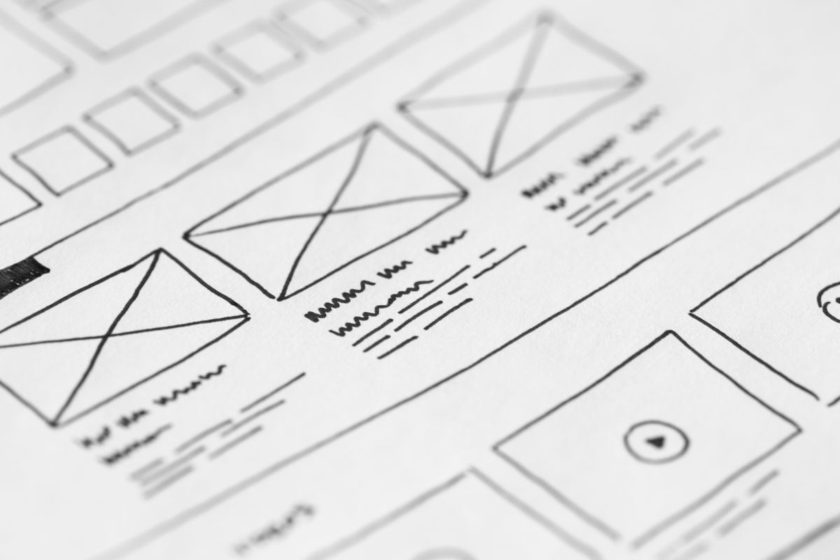
16. Wireframes
Wireframes refer to the earliest possible state of a design solution (hence being low fidelity). They are typically black-and-white sketches that represent the full solution, but shouldn’t overwhelm the review process with too much detail.
Their goal is too indicate functionality, content and structure. Once the wireframes have been agreed between the team and stakeholders, you can proceed to higher-fidelity solutions.
17. User testing
As the name implies, this is simply a way of evaluating the effectiveness of a design solution. For more ambiguous problems, you don’t always know if your proposal will work until you’ve tested it with actual users.
This is often done by sharing a prototype and asking your users to achieve a certain goal. You typically want to ask open-ended questions to avoid confirmation bias — it’s surprisingly easy to lead users down a path that you want to happen, regardless of whether it’s the right thing to do.

General user experience (UX) principles
General user experience principles should be considered when approaching design. I’ve found the following to be most relevant in the work I’ve done, although they should always be applied within the context of a specific project rather than applied as an absolute rule.
18. Simplicity
This should be simple enough to explain? That was terrible, I’m sorry.
With any design, you strive to minimise complexity and establish clarity. A common trap, especially working with smart, driven people, is to intellectualise a solution. But people have busy lives and minds cluttered with things likely far more important than your product.
At least to try give them some respite with a simple, elegant and clear solution.

19. Cognitive load
Cognitive load refers to the amount of mental effort required to comprehend or complete a task. There is nuance to how to apply it, which will depend on the context of each project — your default response may be to assume we want to minimise cognitive load wherever possible, but this is flawed.
For example, what if there’s an important legal document you need your user to comprehend in sufficient detail? You may want to create extra cognitive load to ensure they understand it.
Typically, you want to avoid cognitive overload, where the experience is too stressful or frustrating for a user to achieve their goal.
20. Contrast
Contrast establishes visual hierarchy, offering clearer choices. Typically, this means the most important information is displayed most prominently on a page, and can be used to signify the next action a user should take
There are a lot of ways contrast can be applied, and in each instance you’ll need to think carefully about how you can use it to solve your design problem
- Colour
- Size
- Shape
- Shade
- Texture
- Space
- Motion
21. Progressive disclosure
Progressive disclosure is somewhat linked to simplicity, but mostly focuses on not trying to overcomplicate or overwhelm the product experience.
It aims to simplify complex interfaces or interactions by revealing information or options gradually, reducing cognitive overload and improving the user experience.
By following this principle, you only want to show the information that’s relevant to achieving their next goal.
In form design, an example of effective progressive disclosure is only showing one question at a time, and only when a user has completed one question will they be presented with the next.
Many studies have shown that this increases the chances of people completing the form.
22. No bad or stupid users
There are no bad users, only bad design.
Recall that by default, people don’t read, they skim. Adding needless complexity to a UX not only makes life harder for your users, it has negative business consequences too.
The most dangerous last words before releasing a feature are, “They’ll figure it out.” And inevitably, you then find ways to blame users for being too stupid too figure something out. This is so wrong.
The more effective approach is to ensure the experience is intuitive enough in the first place. Don’t make them think. Product managers own the quality of the product release, and it’s your job to ensure it meets a usability standard.
Psychological concepts to understand
As mentioned earlier, interaction design starts with a focus on understanding how people use products. So it’s worth knowing some foundational psychological concepts about how people behave... remember that while technology changes, people typically don’t!
23. Satisficing
People make decisions by satisficing — it’s often preferable to settle for a satisfactory solution rather than pursue an optimal solution.
You can consider applying this principle to more complex, time-limited and diminishing return-yielding problems.
Let’s say you’re in a new town and have a plethora of restaurants available to you. It might take too much time to go through all the reviews, so for your time and sanity you just head to McDonald’s, which is already known and of a guaranteed quality.

24. Similarity
Elements that are similar are perceived to be more related than elements that are dissimilar — these are typically found in colour, shape, size, texture, or orientation.
Research as indicated similarity of colour results in strongest grouping effect, similarity of shape has weakest grouping effect.
25. Stickiness
Stickiness is a method for dramatically increasing the recognition, recall and unsolicited sharing of an idea or expression.
It was mostly popularised by Malcolm Gladwell in The Tipping Point, and relates to how something becomes embedded in social consciousness – it applies to anything that can be seen, heard or touched.
There are six key variables to stickiness:
- Simplicity – clearly and succinctly without sacrificing depth
- Surprise – idea contains element of surprise, which grabs attention
- Concreteness – idea is specific and concrete
- Credibility – idea is believable, communicated by trusted source or appeals to common sense
- Emotion – idea elicits and emotional reaction
- Story – expressed in story context, improves memorability
User interface (UI) principles
When approaching higher-fidelity stages of design, the user interface (UI) gets more attention. These are some important UI concepts to be aware of as you’re reviewing these hifi designs.
26. Skeuomorphic vs. flat design
Skeuomorphic design typically represents the functions of objects in the real world — this is done via gradients, shadows and textures. It may use visual metaphors in the digital world to represent the physical.
Flat design tends to emphasise minimalism and simplicity, removing textures, gradients and shadows.
In recent years, the mobile revolution has typically shifted UIs from skeuomorphic to flat design due to a need for more rapid and scalable interfaces.
27. Consistency
Consistency helps users understand cohesive patterns in the elements of a product, which ultimately creates a more intuitive and seamless experience.
As one example, having similar ‘discover more’ buttons with different colours on separate pages may create unnecessary confusion.
Consistency should be established across navigation, terminology, visual elements, layouts and interactions.

28. Input controls
These are fields that allow users to input data, make selections or interact with data. Examples include text fields, toggles, buttons, file uploads and checkboxes.
29. Navigation components
Navigation components allow users to move between different screens and sections of a product, usually enabling them to discover information or access different functions. Examples include menu bars, side navigation, tabs, breadcrumbs, dropdowns and pagination.
30. Information components
Information components are simply what the name suggests — they’re elements that present and display information to users. They’re used to help understand and interpret functions on the interface.
Common examples are tooltips, text blocks, notifications, progress indicators and icons.
31. Containers
Containers help to group content and components into cohesive units on a page. These may include boxes, modals, accordions and panels.
Summary & further reading
There’s plenty more to design that what I’ve outlined here, but I hope it’s at least a semi-useful overview on the key principles and techniques of product design.
And while your designer is the person with the expertise, knowledge of the fundamentals will foster a better collaboration, iteration ultimately more effective solutions.
To dive deeper into anything I’ve mentioned, you can check out the following resources:
General UX and design
📚 The Elements of User Experience
📚 The Design of Everyday Things
📚 Universal Principles of Design
Business application of design
📚 Hooked